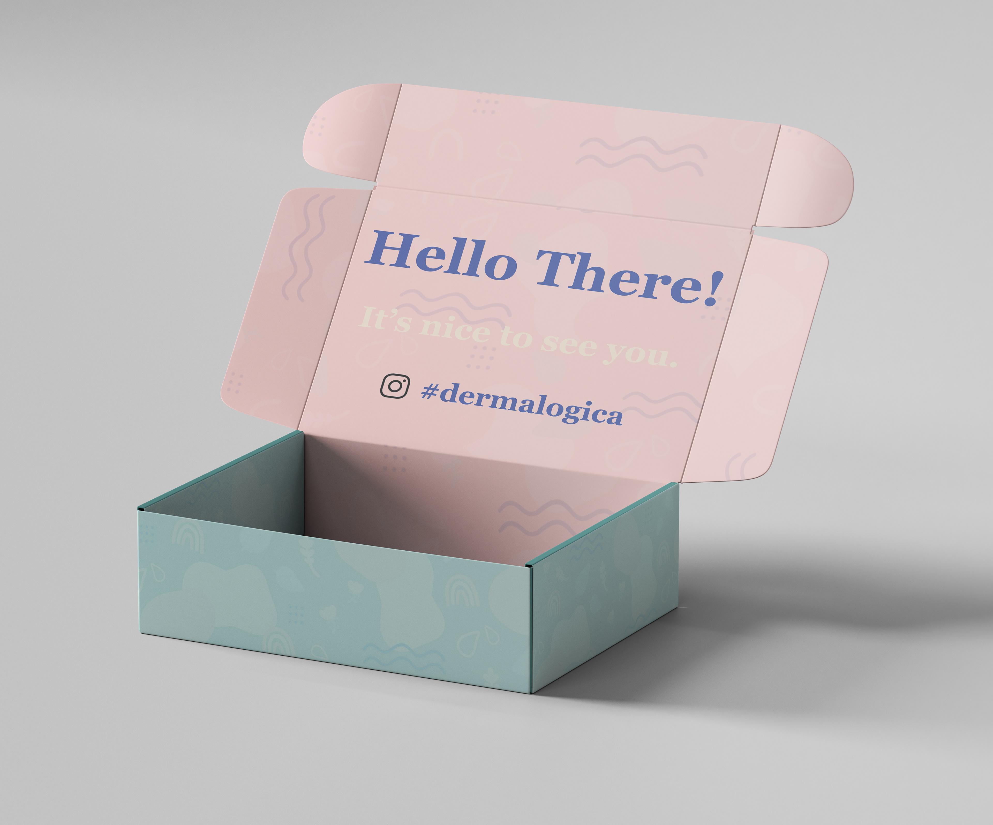
Originally, the Dermalogica brand is seen as quite scientific and impersonal, so I designed these products with warmth, freshness, and humanism in mind. I illustrated the playful pattern on the box and created a new logo for
the Dermalogica brand, combining illustration and typography. I used a typeface that is strong and dependable
and designed a humanistic and organic form to put alongside it. This juxtaposition is representative of the Dermalogica brand as a whole and relates to their audience, reminding them that Dermalogica has their health
in mind and sees them as real people and more than just a number.
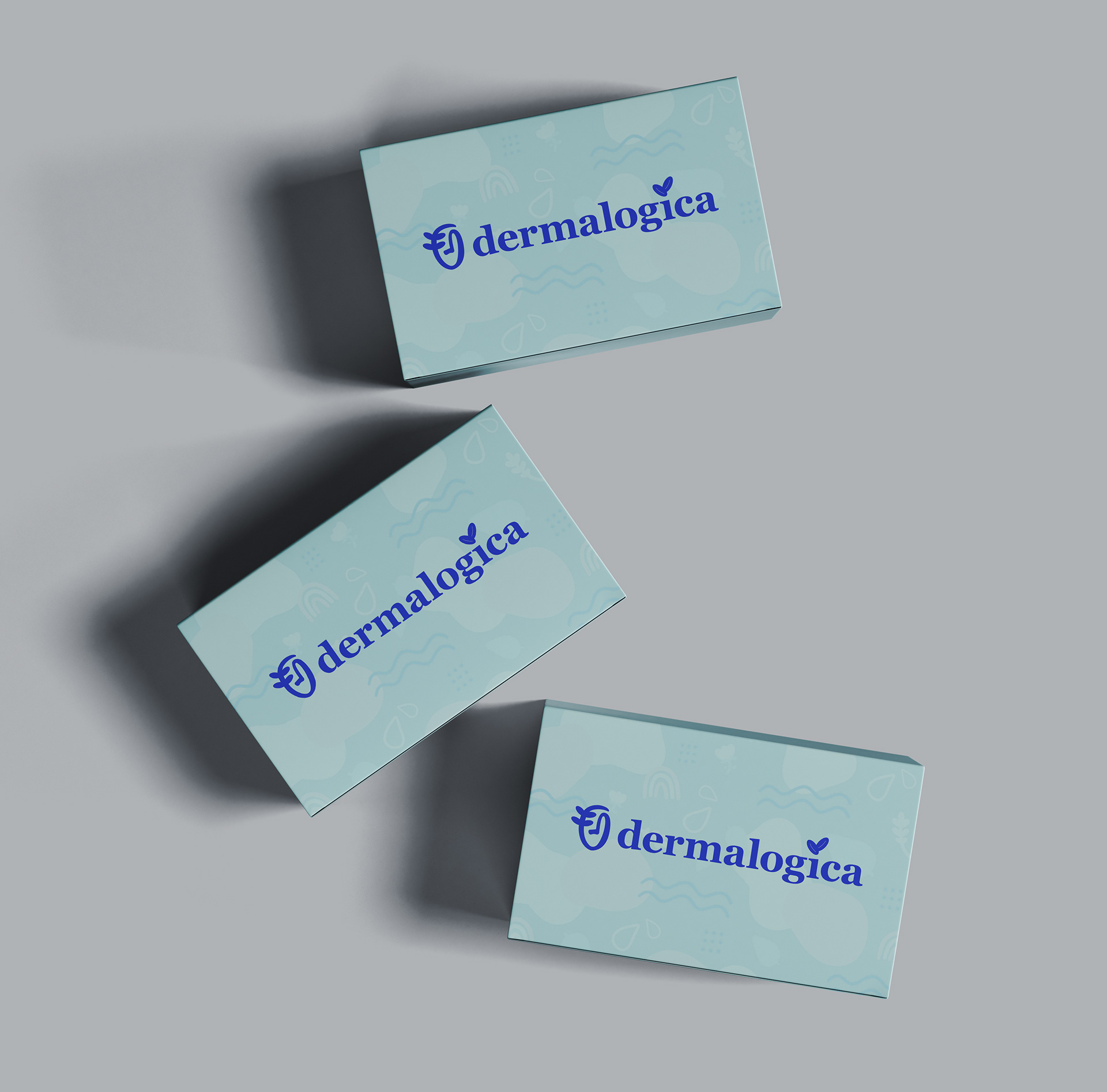
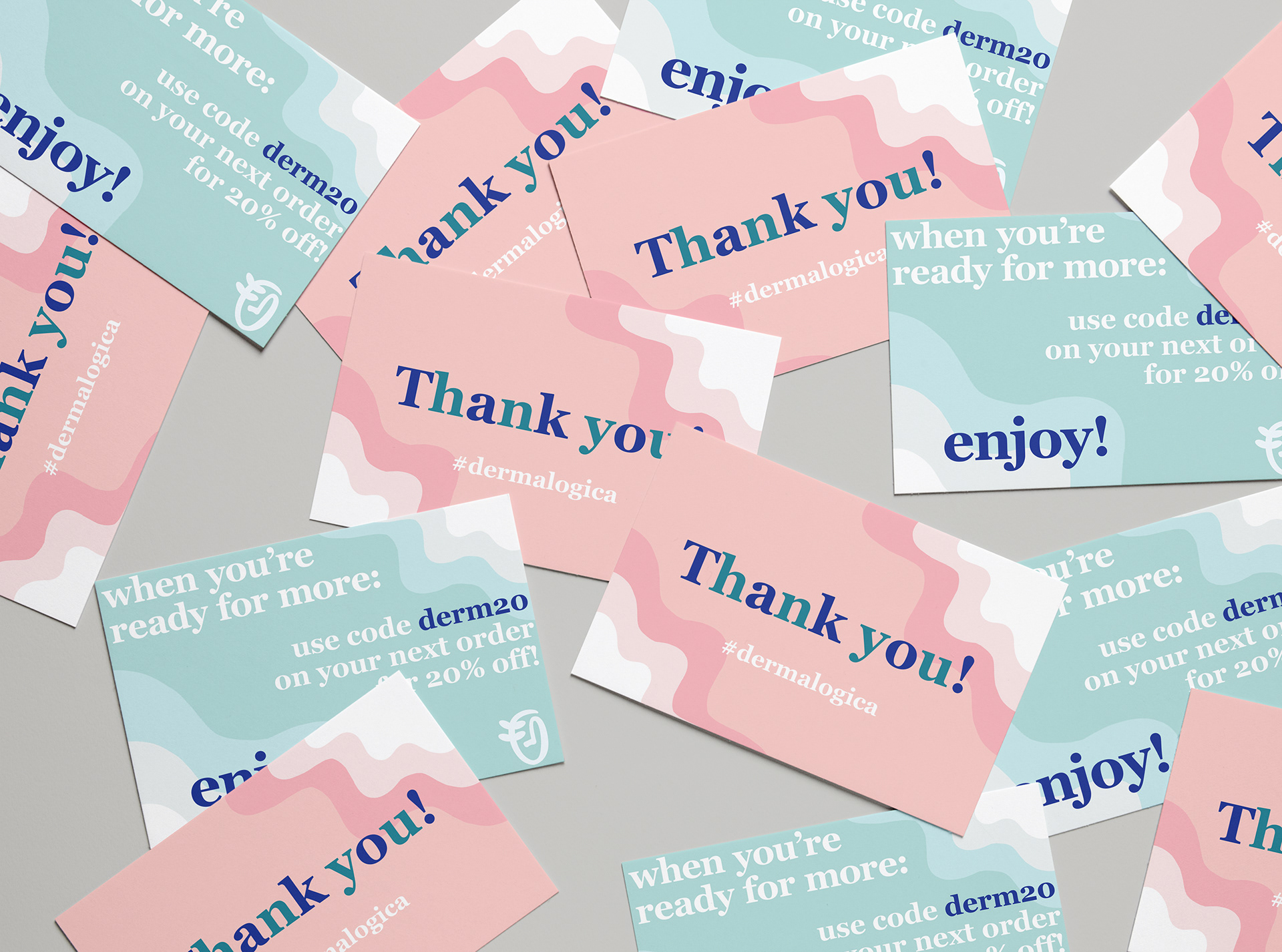
The use of organic forms and a strong typeface continues onto the takeaway postcard I designed to come in the Dermalogica box. This postcard communicates with the customer, thanking them for buying from Dermalogica
and letting them know that they are seen, which is incredibly important. I continued with the feeling of freshness and illustrated organic forms with this postcard, as well, combining it with fun and playful typography.
and letting them know that they are seen, which is incredibly important. I continued with the feeling of freshness and illustrated organic forms with this postcard, as well, combining it with fun and playful typography.